


Data visualization is the act of presenting data into visual forms such as graphs or charts. It is used to summarize data easily and communicates its relationships with other data if needed. It helps to organize data and allows new insights or patterns to be discovered.
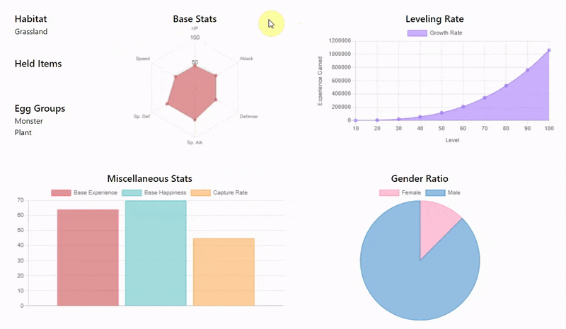
As developers, it is important to learn some data visualization tools. In my How I Built an Image Classification Pokedex article, the app fetches data from the PokeAPI and organizes them into the page below:
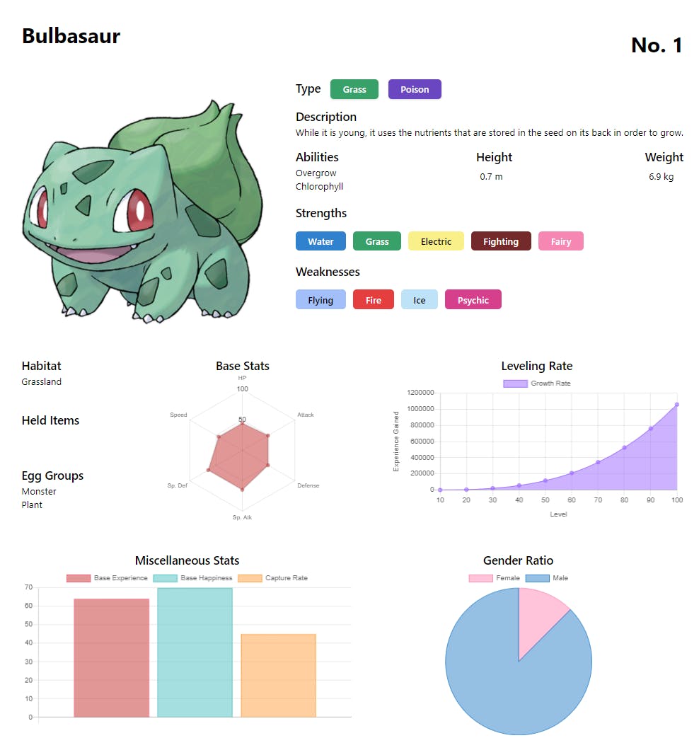
In this article, let's look at Chart.js, the library I used to make these charts, which can be used to organize any form of data into readable visual data.

Getting Started
In this tutorial, I'll use PokeAPI data as examples when I explain how to make these charts. Feel free to use any data you want to organize them using Chart.js.
1. Bar Chart
First, import the library into the HTML page:
<script src="https://cdn.jsdelivr.net/npm/chart.js@2.8.0"></script>
Then, add the canvas HTML element with a bar-chart id attribute. This will be where the bar chart renders.
<canvas id="bar-chart"></canvas>
In a script.js, create a simple function to fetch data from a URL like the snippet below. I won't be going into much detail about how to fetch in this tutorial as this is primarily for Chart.js.
function fetchPokemon(name) {
  return new Promise((resolve, reject) => {
    fetch(`https://pokeapi.co/api/v2/pokemon/${name}`).then((res) => {
      if (res.status === 200) {
        resolve(res.json());
      } else if (res.status === 404) {
        return reject({
          status: 404,
          message: "No pokemon named" + name + " is found.",
        });
      } else {
        reject({
          status: res.status,
          message: "Something went wrong...",
        });
      }
    });
  });
}
Next, create a loadBarChart function which will accept a data parameter to organize our data in the way which we want it to. Here's how we can implement it.
- Get the reference for the
canvaselement by its id attribute. - Get the data we want to display as bars.
- Instantiate new Chart, set it as
type: "bar"and set thedata.
function loadBarChart(data) {
  //1.
  let barChart = document.getElementById("bar-chart");
  //2.
  const { base_experience, base_happiness, capture_rate } = data;
  //3.
  barChart = new Chart(barChart, {
    type: "bar",
    data: {
      datasets: [
        {
          data: [base_experience],
          label: "Base Experience",
          backgroundColor: "rgba(197,48,48,0.5)", //red
          borderColor: "rgba(255, 99, 132, 1)",
          borderWidth: 1,
        },
        {
          data: [base_happiness],
          label: "Base Happiness",
          backgroundColor: "rgba(75, 192, 192, 0.5)", //green
          borderColor: "rgba(75, 192, 192, 1)",
          borderWidth: 1,
        },
        {
          data: [capture_rate],
          label: "Capture Rate",
          backgroundColor: "rgba(255, 159, 64, 0.5)", //yellow
          borderColor: "rgba(255, 159, 64, 1)",
          borderWidth: 1,
        },
      ],
    }
}
As you can see, making a bar chart is as easy as just setting the type and data. The datasets in data is an array of the individual data objects which will render as a bar as seen in the image below.
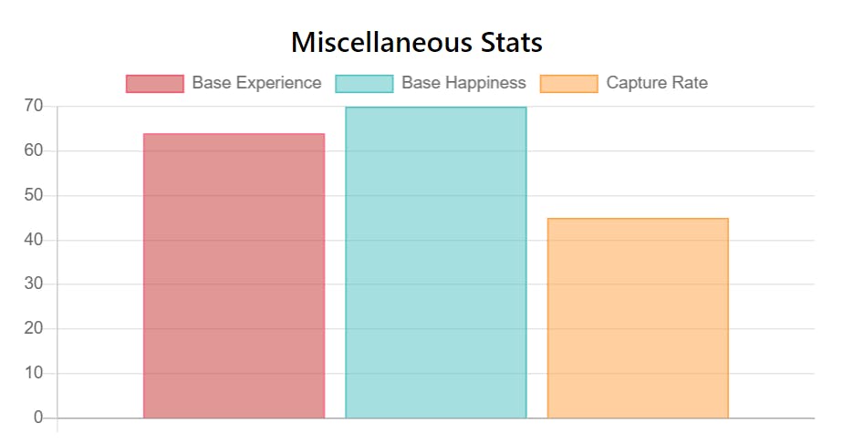
In this example, datasets contains the base_experience, base_happiness and capture_rate data. You can also customize each data object in terms of their label, backgroundColor, borderColor or even borderWidth properties. For example, I customized their labels and colour them in red, green and yellow.
Of course, there are more customization options and styling to choose from. Feel free to read the bar chart documentation for more details. Let's now move on to Pie Charts.
2. Pie Chart
A pie chart is pretty straightforward. It shows a relationship between 2 or more data in terms of percentage. A full pie means 100%.
For my example, I will display a gender ratio as a pie chart. First, create the canvas element for the pie chart to render in.
<canvas id="pie-chart"></canvas>
After fetching from PokeAPI, get the femalePercent data and pass it into the loadPieChart function. Here's how loadPieChart works.
- Get the reference for the
canvaselement by its id attribute. - Instantiate new Chart, set it as
type: "pie"and set thedata.
function loadPieChart(femalePercent) {
  //1.
  let pieChart = document.getElementById("pie-chart");
  //2.
  pieChart = new Chart(pieChart, {
    type: "pie",
    data: {
      datasets: [
        //only 1 data obj in datasets
        {
          data: [femalePercent, 100 - femalePercent], // female, male
          backgroundColor: [
            "rgba(255,137,180, 0.5)", //pink for female
            "rgba(44, 130, 201, 0.5)", //blue for male
          ],
          borderColor: ["rgba(255,137,180,1 )", "rgba(44, 130, 201,1)"],
          borderWidth: 1, //they share the same value so no need array
        },
      ],
      //add custom labels, female first then male
      labels: ["Female", "Male"],
    },
  });
}
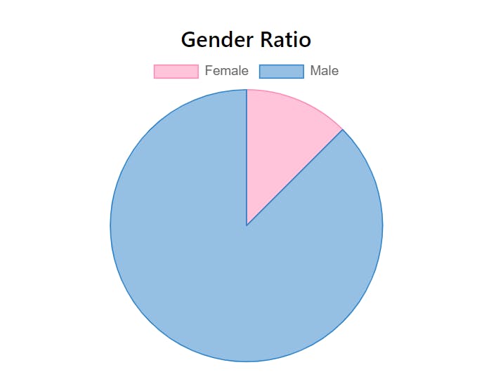
For pie chart, there should only be one data object in datasets because femalePercent and 100-femalePercent(male) combines into 1 whole data. They are not individual data with no relationship to each other.
So now the data in datasets is an array of the data values for the pie chart. In this case, it is the femalePercent and the malePercent which is 100-femalePercent.
Then, we add custom styling such as labels, backgroundColor, borderColor and borderWidth. They are also arrays which represents the female and male percent respectively. Keep in mind that these styling should have the female properties first in their array because that's how it was ordered in the data object.
And we'll get a simple pie chart for our gender ratio data!
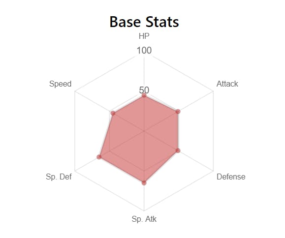
3. Radar Chart
A radar chart is helpful to show a big-picture view on how individual data differs from each other. For my app, I used it to show the stats of a Pokémon and to easily determine its best and the worst stat.
To make a radar chart is simple. First, create the canvas element for the radar chart to render in.
<canvas id="radar-chart"></canvas>
Then, create a loadRadarChart function as follows:
- Get the reference for the
canvaselement by its id attribute. - Instantiate new Chart, set it as
type: "radar"and set thelabelsanddataproperties.
function loadRadarChart(data) {
  //1.
  let statsChart = document.getElementById("radar-chart");
  //2.
  statsChart = new Chart(statsChart, {
    type: "radar",
    data: {
      //Will show up on each radar points in clockwise order
      labels: ["HP", "Attack", "Defense", "Sp. Atk", "Sp. Def", "Speed"],
      datasets: [
        {
          //one data obj per set, order same as labels
          data: [
            data[0]["base_stat"], //HP
            data[1]["base_stat"], //Atk
            data[2]["base_stat"], //Def
            data[3]["base_stat"], //SpA
            data[4]["base_stat"], //SpD
            data[5]["base_stat"], //Speed
          ],
          backgroundColor: "rgba(197,48,48,0.5)", // red
        },
        /*Add another set if needed like so
        {
           data: [ ]
        },
        */
      ],
    },
  }
}
Just like a pie chart, there should be one data object in the datasets array, unless you want to add another separate dataset like the image below.
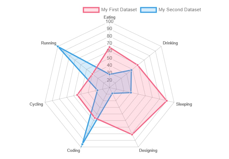
The data object should contain an array of the data values. They will be arranged in clockwise so in this example, HP would start at 12 o'clock and Atk would be on its right and so on.
Remember to add the labels array in the same order as data in order to label each point on the radar chart correctly. Then, you may customize it as usual. Here, I customize its backgroundColor to red.
4. Line Chart
Last but not least, we will build a line chart. This type of chart is to plot points on a line to see trends and to compare if there are multiple lines.
In my app example, I used it to plot a growth chart, using level as the x-axis and experience gained as the y-axis.
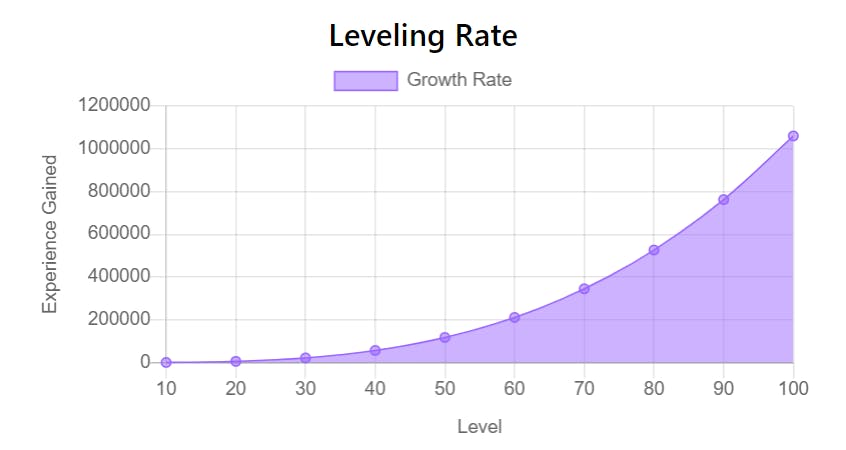
In order to plot a line graph, you need an array of x and y values like the snippet below. Note that the x-axis property (i.e. level) is listed above the y-axis property (i.e. experience).
data = [
   {
      level:10, //x-axis
      experience:560 //y-axis
   },
   {
      level:20, //x-axis
      experience:5460 //y-axis
   },
   //And so on...
]
Once you have a dataset to plot, create the canvas element where the line graph will render on.
<canvas id="line-chart"></canvas>
As usual, create a loadLineChart function as follows:
- Get the reference for the
canvaselement by its id attribute. - Instantiate new Chart, set it as
type: "line"and set thelabelsanddataproperties.
function loadLineChart(data) {
  //1.
  let growthChart = document.getElementById("growth-chart");
  //2.
  growthChart = new Chart(growthChart, {
    type: "line",
    data: {
      labels: data.map((d) => d.level), //x-axis data
      datasets: [
        {
          label: "Growth Rate",
          data: data.map((d) => d.experience), //y-axis data
          backgroundColor: "rgba(153, 102, 255, 0.5)", //purple
          borderColor: "rgba(153, 102, 255, 1)",
          borderWidth: 1,
        },
      ],
    }
  }
}
As seen in the code above, the labels property will plot the x-axis values (i.e. level) while the data in datasets takes care of the y-axis values (i.e. experience).
Result
And with that, you can easily make interactive charts using Chart.js! As you can see in the GIF below, hovering over each data point will display a tooltip about the data so users can take a closer look at the graphs.
Thanks for reading! I hope this article serves a simple introduction to how you can build various types of charts using Chart.js. If it is helpful, please do like and share this article around. Of course, there are more options and customization features in Chart.js. Feel free to browse its documentation (under Resources) to learn more. Till next time, cheers!